A History of Some of UCLA’s Top Logos
UCLA’s logo is one of the most recognizable not just in collegiate athletics here at home in the United States, but also around the world. The logo is uniquely UCLA in its script and in its powder blue and gold colors; seeing it makes any Bruin appreciate the history and success behind it. UCLA is among the leaders in championships in many sports, including men’s college basketball, where its storied programs have won a record of 11 national championships.
1964 – 1995: Classic UCLA Cursive Wordmark
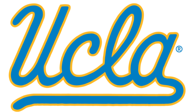
In 1964, UCLA debuted the “UCLA” cursive script, which became so popular that the university used it in this form until 1995. UCLA Football helmets donned this logo throughout these years, and from 1996 to today, it is still used in a modernized form.
1964 – 1995: Joe Bruin
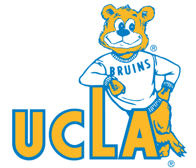
UCLA’s mascot, Joe Bruin makes an appearance in 1964 on the secondary logo, reminding us that UCLA is not just an athletics powerhouse, but that sports are fun. Who doesn’t like an image of a happy Joe Bruin leaning on the wordmark? This logo, again was so popular, that UCLA used it as a secondary logo until 1995.
1972 – Present: “B” for Bruins

In need of a great secondary logo, UCLA kept it simple but memorable with the debut of the “B” logo. This logo featured the powder blue and gold of UCLA’s colors, and is used to this day. It’s memorable, much like a similar logo used for several decades by the Boston Red Sox of Major League Baseball. The “B” logo is still used on memorabilia and apparel, because of its popularity.
1996 – 2003: Modern Joe Bruin
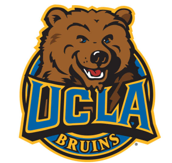
1996 saw the return of Joe Bruin in a more modern form. College athletics programs and professional sports teams updated their logos throughout the 1990s to look more “cartooney” and modernize the look of their age-old mascots. Even the UCLA Bruins wordmark looked more animated than before, in this popular logo of the time. At the end of the 1990s and in the 2000s, several programs and even professional sports teams reverted back to simpler logos.
1996 – Present: Refined “UCLA” Logo

Why change a good thing? That’s especially true for UCLA if it was using a great cursive script logo for decades. So, it essentially did not. Instead, it modernized the look and feel of it with more outstanding colors and inclusion of the word “Bruins.” The result: a great-looking modern version of the older logo, that can be used for decades because it simply looks sharp.
We hope you enjoyed this tour through the history of UCLA’s logos. We hope to bring you more content based on cool UCLA history, trivia and interesting tid-bits that you can enjoy and share.
Go Bruins!
CATEGORIES: Uncategorized
TAGS:
